Rebuilding the isometric visuals, without hurting performance
How we gave the game a visual identity — tier buildings, drawn equipment, status lighting and placement/tier-up effects — while cutting animation cost, not adding it.
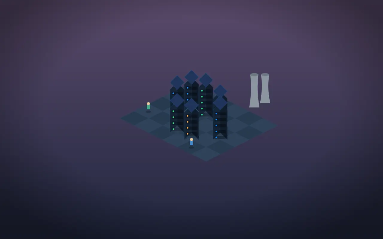
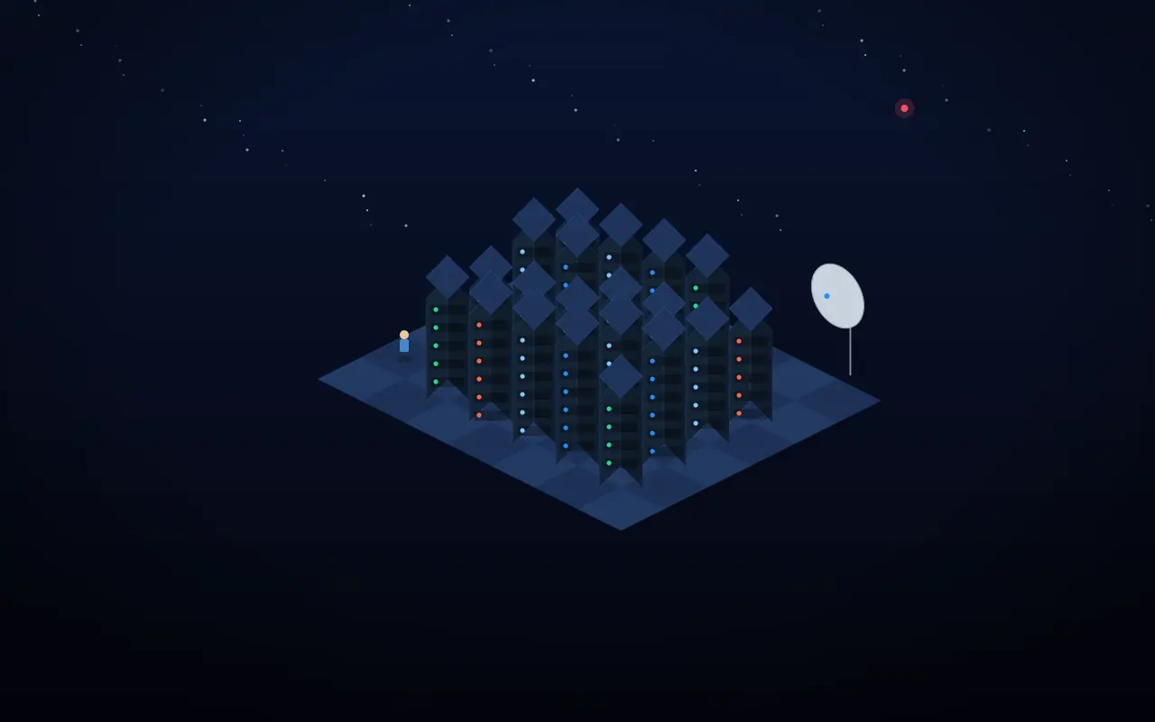
Scale expressed by the facility.
Regional and hyperscale scenes rendered from the tier-aware isometric system.
The goal
Early on, every facility looked more or less the same: a room with recolored walls. A tier-7 hyperscale complex barely read differently from the tier-1 garage. We wanted the building itself to visibly grow with the player, and we wanted the equipment to look like machines rather than emoji stickers — without spending a single extra frame of performance.
Performance first
Before adding anything, we removed cost. Per-frame JavaScript timers were replaced with GPU-composited CSS animations, idle scenes were made to re-render zero times, and dozens of individual animation clocks were collapsed into a handful of shared keyframes. That freed up budget to spend on things players actually see.
Giving the facility an identity
- Tier-banded buildings: a garage door at the start, glass-curtain offices in the middle, accent-lit walls, rooftop HVAC and cooling towers, and a satellite dish and beacon at the top.
- Drawn equipment: power, cooling and network gear now use tile-scaled vector glyphs and silhouettes instead of fixed-size emoji.
- Status you can read at a glance: sleeping servers show a soft "zZ", failing ones vent smoke, and an active incident makes the room lights flicker.
- Day and night: higher tiers live at sunset and night, and windows glow after dark.
Juice, carefully
Placing an item now lands with a little drop-in bounce and a dust ring. Tiering up sends a shockwave across the scene. These moments are one-shot and transform/opacity only, so they feel good without touching the steady-state performance budget.